Picking the Right Font for your Direct Mail Campaign

Font choice can make or break the success of a direct mail campaign. Fonts have the ability to produce a visceral reaction in readers. You want that reaction to be a favorable one. But with so many fonts to choose from and more being added every day, picking the perfect font can be a daunting task.
So how do you convey the message in a way that is appealing to your audience, is recognizable, and gets the point across distraction-free? We’ve got some tips for you.
 BONUS:
 Sans or Serif?
Serif fonts like Times New Roman, Garamond or Georgia are the most popular choices for large chunks of printed text. Studies have shown that serif fonts are easier to read than sans-serif when used in printed material. Large sections of sans-serif fonts cause readers to constantly backtrack and re-read. Not exactly the effect you want to have in a direct mail campaign. We recommend sticking with one of the above serif fonts for letters, brochure copy, and any other large chunks of text. If you want to use a sans-serif font, incorporate it into headlines, pull quotes, or a bulleted list.
Stay on Brand
One function of direct mail is building brand recognition, so it’s important that your mailing materials are in keeping with your brand. Incorporate your company’s logo, as well as the same colors and key design elements that are present in other company materials. Perhaps most importantly, be consistent in your font choice. If your logo and website use Helvetica extensively, you don’t want to suddenly switch to Courier for the postcards you send out. It won’t make sense visually or strategically.
Emphasize Appropriately
Bold and italic fonts can be a great way to underscore certain key points of your message, like “Free” or “New” or a call to action. But that doesn’t mean you should them for the entire mailer. If you emphasize the whole message, you emphasize none of it. It’s just in a really dark or slanted font. Choose wisely. If you wish to incorporate either of these elements into your mailing materials, be sure to choose a type family that offers both variations.
Less is More
Using multiple fonts to complement each other is a pretty standard design practice, but limit yourself to two or three fonts. More than three makes the design incoherent and distracting, and fewer than two simply lacks visual interest. Choose one font for your body text and second for accent text like headers, captions and pull quotes. If you would like to use three fonts, we recommend simply using an italicized version of your accent font for captions.
For more design tips or for help launching your direct mail campaign, give Printing Solutions a call today at 480-596-6300.
Related Posts
How We Make Print Gifting Work Harder for You
Uncategorized
.ps-gifting-article{ –accent:#0a66c2; /* adjust to your brand color */ –ink:#1b1b1f; –muted:#5b5b66; –bg:#ffffff; max-width: 780px; margin: 0 auto; padding: 2.5rem 1.25rem 3rem; color: var(–ink); background: var(–bg); line-height: 1.7; font-family: ui-sans-serif, system-ui, -apple-system, Segoe UI, Roboto, Helvetica, Arial, “Apple Color Emoji”, “Segoe UI Emoji”; } .ps-gifting-article h1{ line-height:1.2; font-size: clamp(1.9rem, 3.2vw + 1rem, 2.6rem); margin: 0 0 […]
Read Post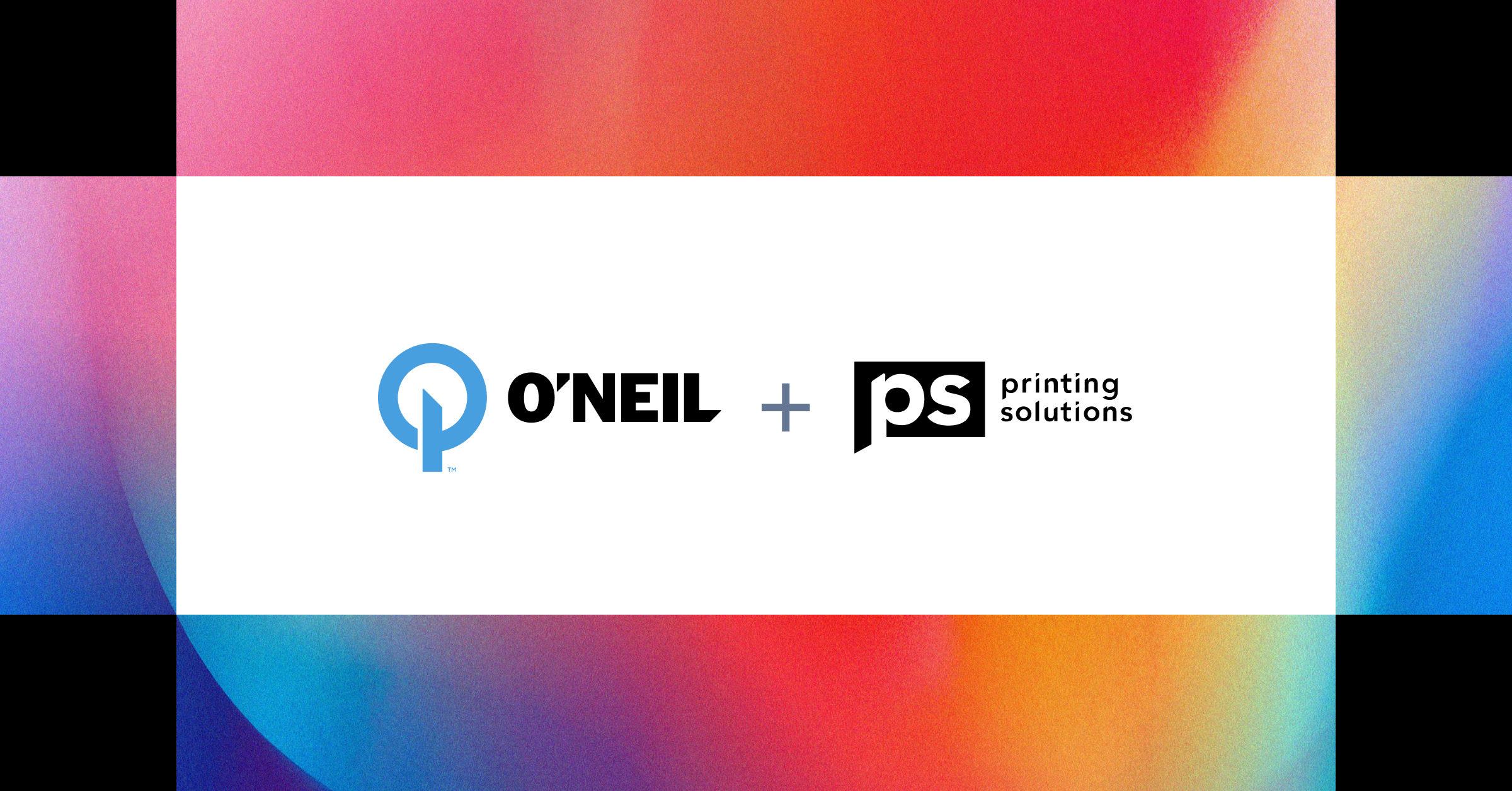
A Platform Built to Perform
Uncategorized
As industries evolve, so do the needs of the businesses within them. Timelines have shortened. Expectations have risen. Customers demand more—from speed to quality to brand consistency. That’s why this new collaboration matters. Together, Printing Solutions, O’Neil Printing, and Rule29 offer a full-spectrum platform—one that connects creative, production, and technology under a single, values-driven umbrella. […]
Read Post
5 Lessons You Can Learn From Big Companies About Branding
Uncategorized
“Branding is king.” It’s become a popular saying over the years, because it tells the truth. In the competitive world of business, if you want to rule your industry’s “kingdom”, then you need to have a powerful brand. A strong brand is the gold crown on your head AND the throne you’re sitting on. […]
Read Post