The Worst Advice I’ve Heard About Print

Food For Thought, Friendly Advice, Print Marketing Advice
One of the hardest things about running a business is finding the right printing company. Knowledge and expertise varies from printer to printer. Unfortunately, this can create confusion for clients who aren’t familiar with the print process.
We have clients all the time who receive the incorrect idea about print by other companies. Here’s some of the worst advice someone could give you about print. And what really goes into a creating a flawless project.
Bad Advice #1: Color matching should be a piece of cake.
Color matching is one of the hardest things for a printing company to conquer. Here at Printing Solutions we print CMYK. Cyan, magenta, yellow, and “key” (or black). This applies to most of the projects that we handle. You’re probably familiar with these colors from your standard desktop printer.

Each of these 4 colors needs to mix together perfectly to produce the exact color from the original batch. If the formula is even slightly wrong, then each run of prints may have a slightly different color. Color matching is a very tedious process that leaves no room for error.
“If you are a business that requires your colors to not fluctuate even by the slightest bit, you need to go with a Pantone print ink,” says Kristyn Dingman, Printing Solutions’ Director of Marketing. Pantone inks are pre-mixed and do not fluctuate in color tones. Unfortunately, this also makes Pantone colors a more expensive option.

A more cost-effective option would be to pick out a pantone color that we then convert to CMYK. While not as exact a match as printing in a Pantone ink, this is a more precise method than simply mixing CMYK colors and hoping for the best.
Bad Advice #2: Setting up print-ready files should only take a few minutes.
Setting up print-ready files can be a long process. Printing clients often think they have sent print-ready artwork. They do not fully understand what really needs to happen for a design to truly be ready for print.
“There needs to be proper crop and bleed marks attached to the artwork, according to our standards,” Kristyn says. “You also need to make sure if you need to change or update something on a piece of artwork that you embed fonts and outline logos.”
If you’re familiar with Adobe Photoshop, Illustrator, or InDesign, then you can probably set this up yourself. But if you’re not sure how or where to find these tools in the programs, than you’re better off having our designers set this up for you.
But be aware that having our design team do this for you takes time. We not only make the necessary changes to your existing files, but we also download and save each layer and file to your account.
“It’s definitely not as simple as you may think, but our designers do the best they can in a short amount of time,” Kristyn says.
Prepare to pay for a bit of design time if you do not have 100% print-ready files. We charge around $10 to set the files up for print.
Bad Advice #3: You don’t need bleed and crop marks on your artwork.
Bleed and crop marks are two of the most commonly overlooked features when getting a file ready for print.
Everything we print here at Printing Solutions starts out slightly larger than the finished product. Once we go to print, all pieces of artwork need to be cut down to size. Crop marks are an essential element because they lead the way for a printer when it comes to sizing and cutting properly.
“Not having crop marks on a piece of artwork tells the printer that you do not want the piece cut to a size,” Kristyn says. Not having these causes confusion from computer to printer. And it could result in a final product that you’re not happy with.

An area called the “bleed” is what allows the color to go all the way to the edge of your printed piece once it’s cut down to size at the crop marks. The bleed extends slightly past the crop marks on all sides to ensure that your design looks flawless, even if the cut is slightly misaligned.
Not having bleed on your artwork tells the printer that you don’t want the flood of color to go to the edge of the piece. For example, if you wanted a navy blue background on your business card with no bleed, this would make your cards have a white border. A card with bleed allows the navy blue to run off the edge of the paper, giving it a seamless look.
While we do not require you to have bleed on your artwork, it is more common than not, and can be extremely helpful in producing a final product that you love.
Need To Confirm More Advice?
At Printing Solutions, the best thing we can do to correct any misunderstandings about print is to educate our clients. We do this by explaining the issue or by physically showing them examples of what we will correct. It’s important that our clients know we can offer a solution to any issues or concerns that come up. Our job at Printing Solutions is to provide the best service and assist our customers in finding solutions for their print marketing needs.
We are here to make sure we can connect with each person who walks through our doors. Let’s make this foreign thing called “printing” and make it not so scary. Contact us at 480-596-6300 to learn more.
Related Posts

Our 3 Favorite TED Talks You Must See
Business Strategy, Food For Thought, Friendly Advice, Marketing, Networking, Social Media, Trends
TED Talks are a big part of the Printing Solutions culture. They’re a great way to educate ourselves on specific topics without added bias, opinions, or unnecessary influence. We go to TED talks for inspiration, education, and as an entertainment resource. Every so often, someone on the team will find a useful TED talk and […]
Read Post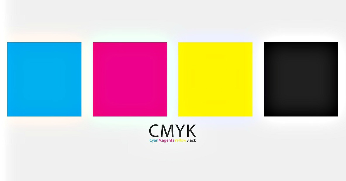
Everything You Need to Know About CMYK
Design, Friendly Advice, Print Marketing Advice, Printers, Printing Trends
In the world of printing, finding the right color is far from an exact science. Each individual ink and printing method gives slightly different results, and matching the colors of a new project with those of a previous one can be difficult. Fortunately. CMYK printing gives very similar results at a high quality. Here’s an […]
Read Post
10 Things that Help the Printing Solutions Team Stay Inspired
Business Strategy, Food For Thought, Friendly Advice
In the creative industry, one of the most valuable resources is inspiration. Getting inspired can make or break a big project and can completely change a team’s mindset. Here at Printing Solutions, we are constantly finding new ways to not only inspire each other, but ourselves as well. Here are the top 11 things that […]
Read Post