What Colors Work Best for Direct Mail Campaigns?
When you hear the word “growth,” do you picture a certain color? Do you picture green?
If you said yes, you’re not alone — growth and longevity are two of the words most commonly associated with the color green. And it’s that power of suggestion that makes color one of the best marketing tools out there. Color speaks. It’s a form of nonverbal communication because it carries meaning through association, but it carries every bit as much meaning as the words you choose.
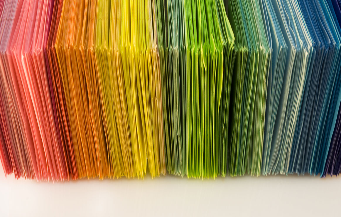
So what colors work best for direct mail? That depends on what you’re trying to accomplish and who you’re targeting, but there are a few that usually do the trick. We’ve got a breakdown for you below.
 BONUS:
 Blue
Blue is the most commonly used color for direct mail and marketing. Not surprisingly, in color psychology blue generally represents trustworthiness and professionalism. But there’s more to its popularity than that — more than half of Americans report blue as their favorite color, and men tend to respond strongly to it, though it doesn’t do quite as well with women. The downside: Blue suppresses appetites, so if you’re marketing a food product or restaurant, this may not be your best option.
Red
Whereas blue indicates trustworthiness and dependability, red is generally perceived as exciting, bold and risky. It may also be seen as romantic or amorous — think roses and wine. Red draws the eye more than any other color, and it increases appetites, especially when combined with yellow (think of every fast food logo ever). Because it has such a draw, red may not be the best choice for a main color. Use this one sparingly, pulling it out for accents and emphasis.
Yellow
Yellow can be a great choice for direct mail materials if you’re trying to generate happiness and optimism, but it can be fatiguing to read for long periods. Consider using yellow as an accent color rather than your main tint.
Green
Green has proven quite effective for direct mail related to growth, health or safety. Traditionally it has signified abundance, money and healing, but recently has been expanded to encompass recycling and environmentalism as well. It is generally a calm, soothing color that puts people at ease, which may contribute to its effectiveness in direct mail.
Black and White
These two colors show up somewhere in almost every design, but their use should be strategic. Though often considered a power color, black can also be reminiscent of evil or death. White is often associated with purity, but it can also come across as sterile or cold. When used together without a more striking color, black and white can be a bit boring. Balance them with more visual interest for the best success.
Purple
Purple is rarely the best color choice if you’re trying to appeal to both men and women — though most women respond well, men tend to have a negative reaction to the color. Consider using it for campaigns that target mainly women.
Orange
Orange is widely reported as being America’s least favorite color, possibly because it sends mixed signals — dark orange can signify a lack of trustworthiness, while a more yellow orange can be related to wealth or wisdom. An orange that falls more in the middle can convey energy, warmth and enthusiasm. If you’re thinking of using orange in your direct mail campaign, consider the various shades and tints of orange carefully.
For more design tips or for help creating a direct mail campaign, give Printing Solutions a call at 480-596-6300.
Related Posts
How We Make Print Gifting Work Harder for You
Uncategorized
.ps-gifting-article{ –accent:#0a66c2; /* adjust to your brand color */ –ink:#1b1b1f; –muted:#5b5b66; –bg:#ffffff; max-width: 780px; margin: 0 auto; padding: 2.5rem 1.25rem 3rem; color: var(–ink); background: var(–bg); line-height: 1.7; font-family: ui-sans-serif, system-ui, -apple-system, Segoe UI, Roboto, Helvetica, Arial, “Apple Color Emoji”, “Segoe UI Emoji”; } .ps-gifting-article h1{ line-height:1.2; font-size: clamp(1.9rem, 3.2vw + 1rem, 2.6rem); margin: 0 0 […]
Read Post
A Platform Built to Perform
Uncategorized
As industries evolve, so do the needs of the businesses within them. Timelines have shortened. Expectations have risen. Customers demand more—from speed to quality to brand consistency. That’s why this new collaboration matters. Together, Printing Solutions, O’Neil Printing, and Rule29 offer a full-spectrum platform—one that connects creative, production, and technology under a single, values-driven umbrella. […]
Read Post
5 Lessons You Can Learn From Big Companies About Branding
Uncategorized
“Branding is king.” It’s become a popular saying over the years, because it tells the truth. In the competitive world of business, if you want to rule your industry’s “kingdom”, then you need to have a powerful brand. A strong brand is the gold crown on your head AND the throne you’re sitting on. […]
Read Post